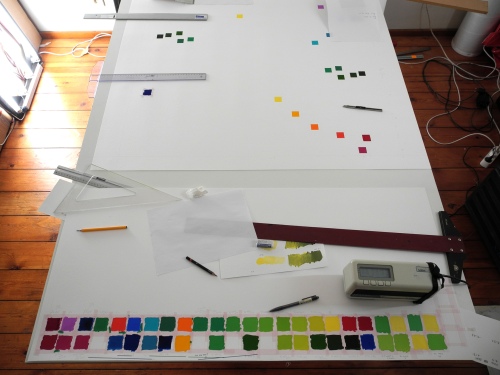
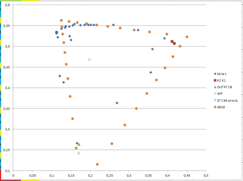
I am expanding my color “gamut” by making “subtractive” pigment mixtures. Everything is “plotted” in a CIE u’v’ diagram (see below).
The blue dots are measured colors, the two red squares are very pure cadmium Reds, the green triangle and the light blue cross are my new best Blues (one being very very dark: 3% of light diffusion), the cross in the middle is the white point. The Orange dots represent the limits of the sRGB gamut – I’m getting very close!
I figured out that even my best mineral pigments can become better by “purification” using transparent organic pigments.


11 responses to “expanding the collection of colors (finally able to work a bit!)”
This is the right direction Adrien, you are right, transparent pigments are the way to go. With these 3 transparent colors you can paint a full color painting in any media. Magenta = PR122, Yellow = PY150 or Py153, Cyan = PB15.3
Yes organic pigments are very interesting. You made me discover it, thank you Don.
I am still sure that PR122+PB15 cannot make better than my best ultramarine blue, but I can make most of my best mineral pigments better by mixing them with organic ones!
However, nothing beats the cadmium oranges and reds. I tried PR122 with cadmium orange and compared with cadmium red, cadmium red is better.
For the greens, its funny. Phtalocyanine is clearly better than what I ever used before. However there’s a limit the mineral pigment can take: if I put more than 1/8 of phtalo in the cadmium, the mixture is too saturated and the behavior of the paint becomes unpredictible. So I have a “limit-green” for each cadmium.
In the blue-green region I still don’t know what to do, I have this beautiful cadmium turquoise light from kremer, and phtalo+charge mixture, that’s all.
I dont think PR122+PB15 will beat the best ultramarine blue, however I “purified” my ultramarine with phtalocyanine blue: amazing! What a nice color I get, very dark but soooo saturated.
PR122, I still don’t know what exactly I’m gonna make with it! but I’ll find a way for sure.
I tried PY150 in my water-based binder (fishglue+alcool), and no problem! it’s perfectly usable, but this PY150 I really don’t know what to do with it! I want to try to get dark yellows with it but I didn’t try yet. What else would you use it for? (keeping in mind that I’m ONLY interested by very saturated colors…)
Hi Adrien, full speed ahead!
You said, “However, nothing beats the cadmium oranges and reds.”
Here is another magenta, Opera Magenta Pr122+BV10, it’s made by a Korean company, Shin-Han. It first came out as a water color, now it also made in an emulsion oil/water tube. Transparent yellow Tartrazine PY100 and Opera will make stronger and brighter oranges and reds.
http://www.realcolorwheel.com/opera.htm.
It’s great to have PY150 (transparent yellow brown/side) and use the dry pigment in fish-glue and alcohol, I used gum arabic. It is necessary to use alcohol with PB15 but not with Tartrazine, but I can’t see any problem using alcohol with PY150.
You must get my approved PY100 Tartrazine from the only company I’m sure of. Spectra Colors in Kearny, New Jersey. SpectraColors.com
Talk about saturated.. I use a (water1:1ethylene glycol)=29:1Tartrazine mixture in my ink-jet plotter instead of the opaque yellow sold all over the world now. The mis-information problem the ink suppliers have is this: “A lithograph printer that lays opaque yellow down first on white paper and transparent magenta and cyan on the top of it prints just fine, so it will work in plotters just fine also”.
Here’s the problem, ink-jet printers spray all the colors at once, opaque yellow lightens the mixture so more black ink is necessary to compensate. I use a transparent yellow which make the other primaries darker, not lighter, so I can (and do) use less black ink and show more color on my prints.
I never noticed the “green-limit” before, I was never looking for it. Did you try Bismuth Vanadate opaque yellow? I think its better than cadmium yellow, she’s a one trick pony, yellow only.
Making dark yellows with PY150; With the three transparent primaries you can make dark brown, the darkest yellow. Red darkens to a similar brown passing through red oxide on the way to dark. It’s easy to make by just adding pure cyan.
Magenta Pr122 and Opera Magenta Pr122+BV10 http://www.realcolorwheel.com/opera.htm. PR122 makes a better blue than PV19 but PV19 makes a better red. PR122 is best overall for painting.
This is another painting with opera.
http://www.realcolorwheel.com/operamagentasilk-greencarnations-wc11x15.htm
It’s great talking to you.
Hey Don, thanks for the msg, happy new year too.
I just mixed +-60 pigment body-colors and I will see where new pigments are needed.
I am still not sure about what you said: organic pigments can beat a good ultramarine and cadmium reds… However, it’s great to mix organic with mineral basis. Thanks so much for advising!
If you really want to be sure that your colors are the strongest, I can send you a sample of my new blue (Ultramarine greenish extra Kremer + PB 15.7 Lukas), it’s so pure it’s a-ma-zing! I really doubt it would be possible with organic pigments only.
A
You haven’t tried Opera yet, get it from Shin-Han, they have the smallest grind. Make your own reds and blues. I said they would be stronger than anything available.
“However, nothing beats the cadmium oranges and reds. I tried PR122 with cadmium orange and compared with cadmium red, cadmium red is better.”
That’s not a fair test. Try PV19 with PY100, or better yet, PY100 with Opera.
“If you really want to be sure that your colors are the strongest, I can send you a sample of my new blue (Ultramarine greenish extra Kremer + PB 15.7 Lukas), it’s so pure it’s a-ma-zing! I really doubt it would be possible with organic pigments only.”
Before you send me the new blue, test PB15.3 and Opera. Second guessing doesn’t do it and you can do it.
My understand is PB15 goes from 1 to 6. I tried them all from Kramer. Lucas (almost unknown) coming out with a PB15.7 is in my mind, dubious.
I didn’t even like the PB:15.6
There are other pigments not as poisonous as cadmium’s, very bright and opaque. Cadmium’s are good but they are on their way out. It may be made with MANGANESE. I read an article on it just last week but I can’t find it. Sorry.
Okay, Maybe it’s not a fair test.
However, I cannot work with watercolor, gouache or acrylic, is it possible to buy Opera pigments only, or maybe I should mix this color by myself from pigments…
The Phtalocyanines from Kremer are BASF ‘heliogen’. I find them really nice. The Lukas one is actually PB15/74160 it’s actually perfect to filter the red end of the ultramarine reflectance spectrum without removing too much blue. A 1:1 mixture of Ultramarine Greenish / PB15/74160 gives a Blue which is darker than most Blacks, same level of lightness as Spinel Black (around 2.5%)
A
I was thinking along the same line, buy some dry pigment. I saw some advertised and got it but it had a problem. it bled. You will have to get it direct from Shin-Han, if they will sell it. You could always crush and wash out the tubed color, you can’t mix the color with other pigments, it’s a new color.
Right now I’m copying a DVD of this w/c.
http://www.realcolorwheel.com/tomsdriveway-pierosview.htm
It has the Opera painting I’m talking about. Maybe this would be a better url.
http://www.realcolorwheel.com/opera.htm
74160 is a CI# not the extension of the Pigment Number. You were talking about PB15. A perfect cyan.
Ah really? that’s a 15??
Yes, What about the Opera? Are we going t0 break this color out to the world? They need it.
What’s the color index n° exactly?
Natural, like Naples Yellow Natural is Antimony yellow